
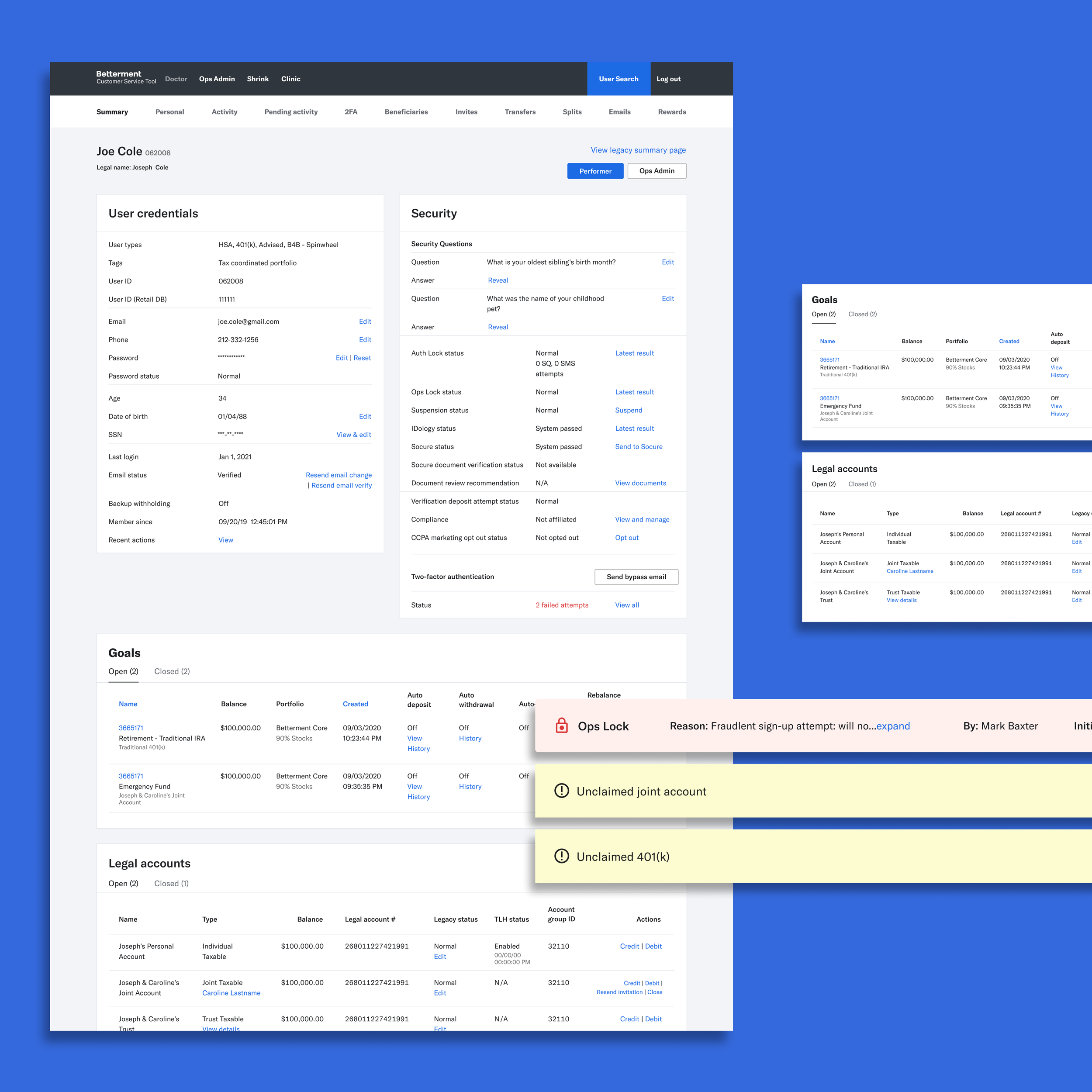
Doctor Summary Page Revamp
Case Study
Project Overview
CHALLENGE
As Betterment’s customer base grew, the internal Customer Support and Ops dashboard became cluttered. The Summary page absorbed new data without a clear structure, slowing agents during live calls.
SOLUTION
I redesigned the Summary page around the real support flow, moved secondary information to more relevant areas, and created a standardized system for how new data points are added. The result is a cleaner, faster, and more scalable tool for agents.
ROLE
Product Designer
TEAM
May Felix (Product Manager)
Martin Kang (Engineering Manager)
Thomas Sutton (Customer Support)
Mark Kassardjian (Operations)
+ 6 Engineers
Opportunity
Betterment’s internal CRM tool, Doctor, houses data for the entire user base. Customer Support relies on it during phone and email triage, and nearly every other team uses it to monitor activity and complete operations tasks.
As the company scaled, the Summary page became overloaded with information. What was originally an at-a-glance overview had evolved into a catch-all. With an upcoming migration to a new component library, we had the perfect moment to step back, reassess what belonged on this page, and redesign it with intention.
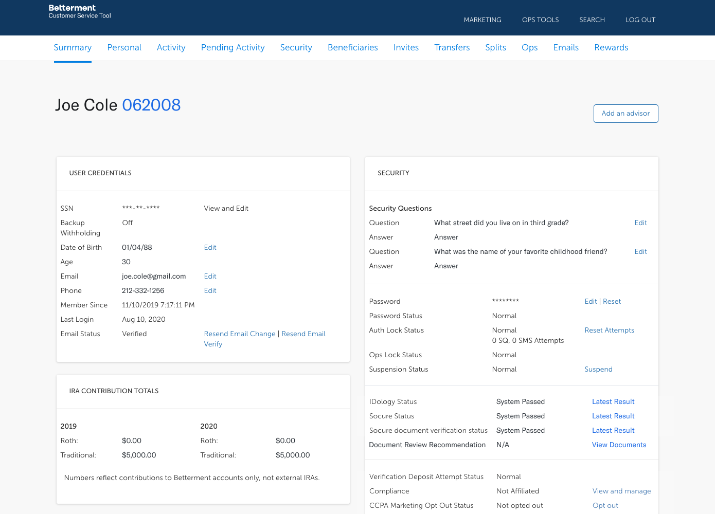
The Summary page before the redesign — a long, unstructured layout that accumulated years of incremental additions.
Development
I used two primary research methods.
I conducted contextual inquiry by shadowing Customer Support agents during live calls, then led follow-up user interviews across teams who relied on Doctor for different workflows.
As prototypes were built, I stayed in an ongoing feedback loop with these internal users, iterating quickly and validating design decisions through real workflows.
Outcome
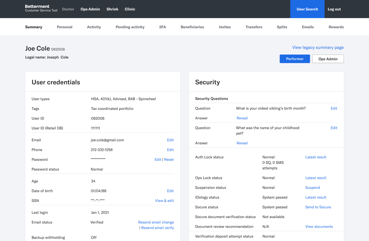

Summary Page 2.0 — cleaner, structured, and aligned with the actual support flow. Key identity + account details surface immediately for faster triage.

We launched Summary Page 2.0 after testing multiple configurations. The new version centers the Customer Support agent as the primary user. The layout is slimmed down to only the information needed at a glance, with account and identity verification surfaced immediately above the fold.
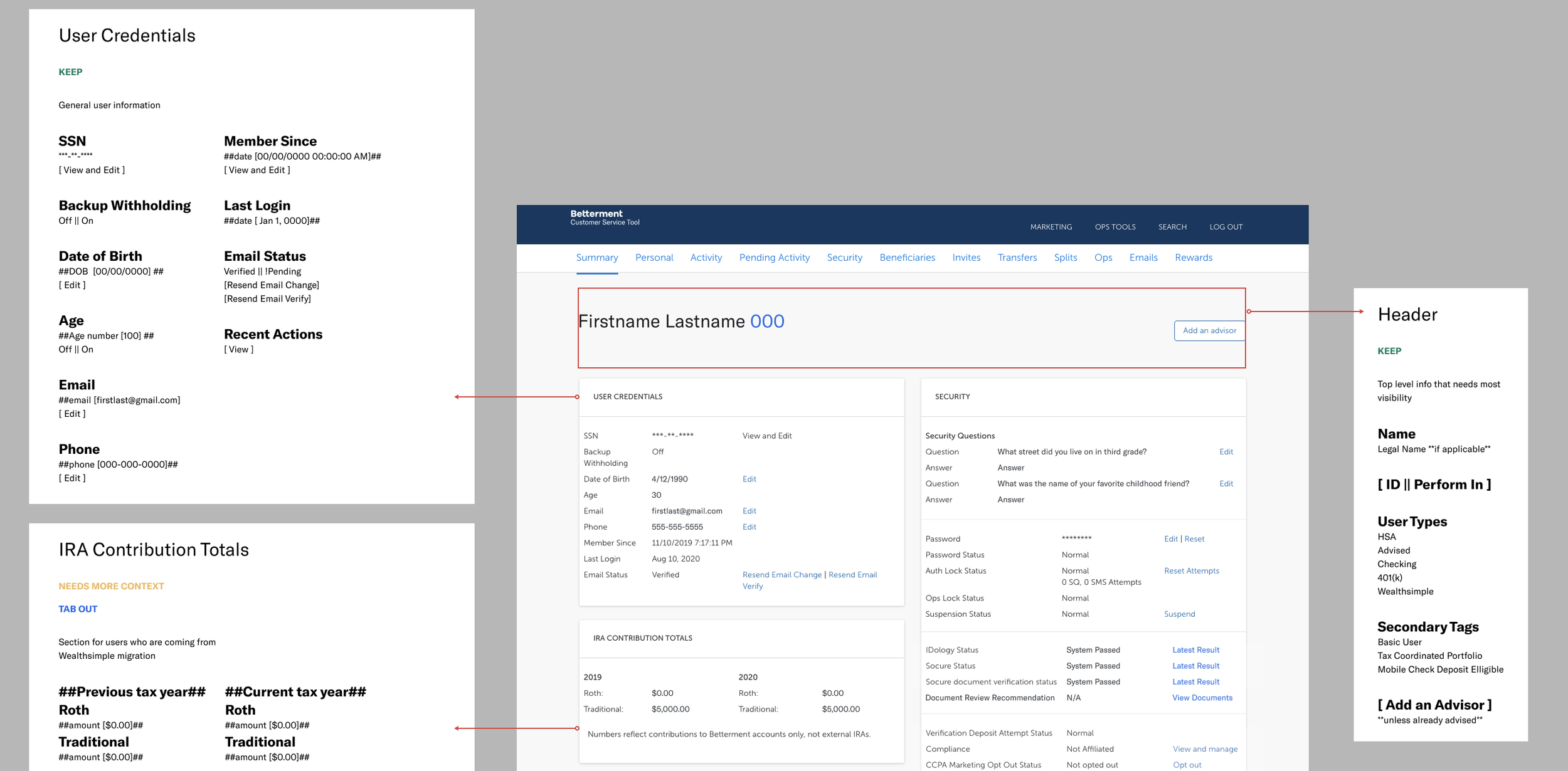
Secondary information was reorganized into clearer tabs and sections across the app. This allowed the Summary page to return to its original purpose: a fast, actionable snapshot instead of a cluttered archive.
Rollout
Because Doctor is used by many teams across operations, the redesign required a careful transition.
We hosted open feedback sessions throughout development to capture edge cases early. Once we entered rollout, we kept a link to the old Summary page for two months so users could fall back if needed. I tracked fallback clicks and interviewed anyone who relied on the old page, making targeted revisions. After two months, we removed the link with full confidence that the new structure supported all workflows.
To prevent the Summary page from becoming bloated again, I created a guideline system for how new information should be evaluated, added, or relocated. This standardized process ensures that as the company scales, Doctor scales with it in a sustainable and intentional way.
Next Steps
Doctor is a power-user tool that displays a large amount of data, and current navigation depends heavily on the user knowing where to look. Future improvements will focus on shifting the system toward more intuitive, guided flows. Areas of opportunity include:
A sequential triage flow that mirrors how Customer Support agents work through an issue.
Customizable dashboards for teams to surface the data and actions most relevant to them.
Note: To respect confidentiality, all data has been anonymized and certain visuals have been recreated while preserving the underlying design problems, process, and outcomes.