
Uber Eats
Bookmark Comparison
Case Study
Project Overview
CHALLENGE
As Uber Eats emphasizes larger selection within the app, users are more susceptible to overchoice when deciding between restaurants.
SOLUTION
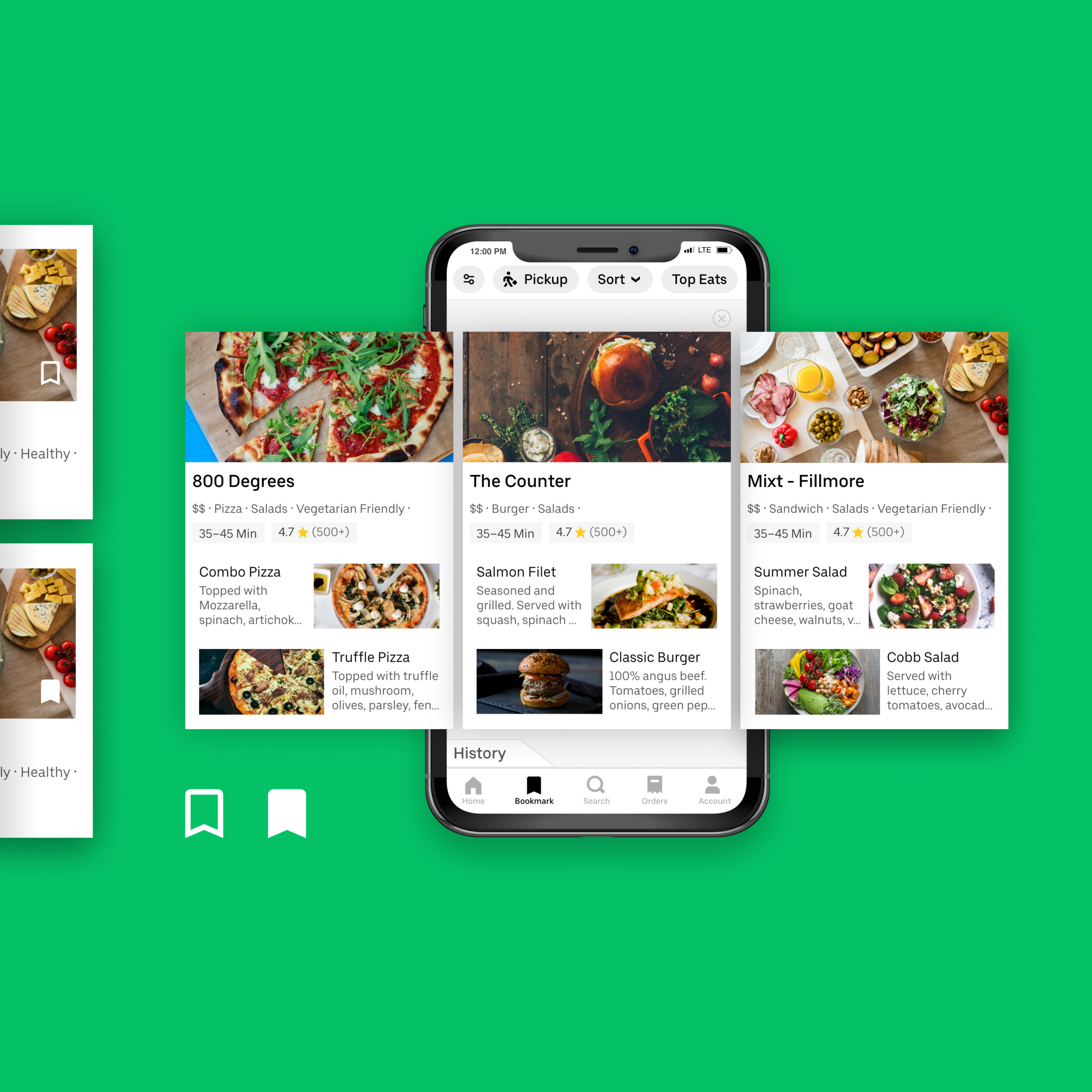
A new feature that facilitates comparison and discovery of restaurants through a Bookmark feature where users are able to bookmark restaurants and compare selections more in-depth in a separate UI.
ROLE
Product Designer
TOOLS
Figma, Principle, Google Sheets, Pen & Paper
Opportunity
As Uber Eats expanded its restaurant network, the growing selection risked overwhelming users. Simplifying how people navigate selection could improve conversions for the business and visibility for restaurants, creating value on both sides of the marketplace.
I explored two complementary directions to simplify choice and spark curiosity:
Comparison: Helping users evaluate options side by side instead of endlessly filtering.
Discovery: Creating space between browsing and checkout to encourage exploration and curiosity before commitment.
Development
I interviewed food delivery app users to understand how they make decisions under time pressure. What started as an exploration into ratings evolved into a deeper look at how users compare and commit when faced with too many choices.
Key pain points emerged around comparison and cognitive load: users struggled to weigh options far apart in the feed and tended to pick from the first few restaurants they saw.
“A simple star rating isn’t enough for me to compare.”
“If I wait too long, prices might go up — I just pick something fast.”
These insights shaped two goals for design exploration:
Make selection faster and easier.
Create moments for discovery and curiosity.
Outcome
I introduced a lightweight bookmarking tool that lets users flag restaurants they want to compare during a session. Bookmarks act as short-term decision aids, while Favorites remain long-term signals of trusted places.
On the homepage, the Bookmark icon sits at the bottom right of each restaurant card, and the Favorites icon shifts left to create clear separation and reduce confusion.
A new Bookmark section gives users a focused comparison space with a horizontal carousel that shows only their saved options. Each card includes richer details, such as two recommended dishes, which supports faster scanning and easier evaluation.
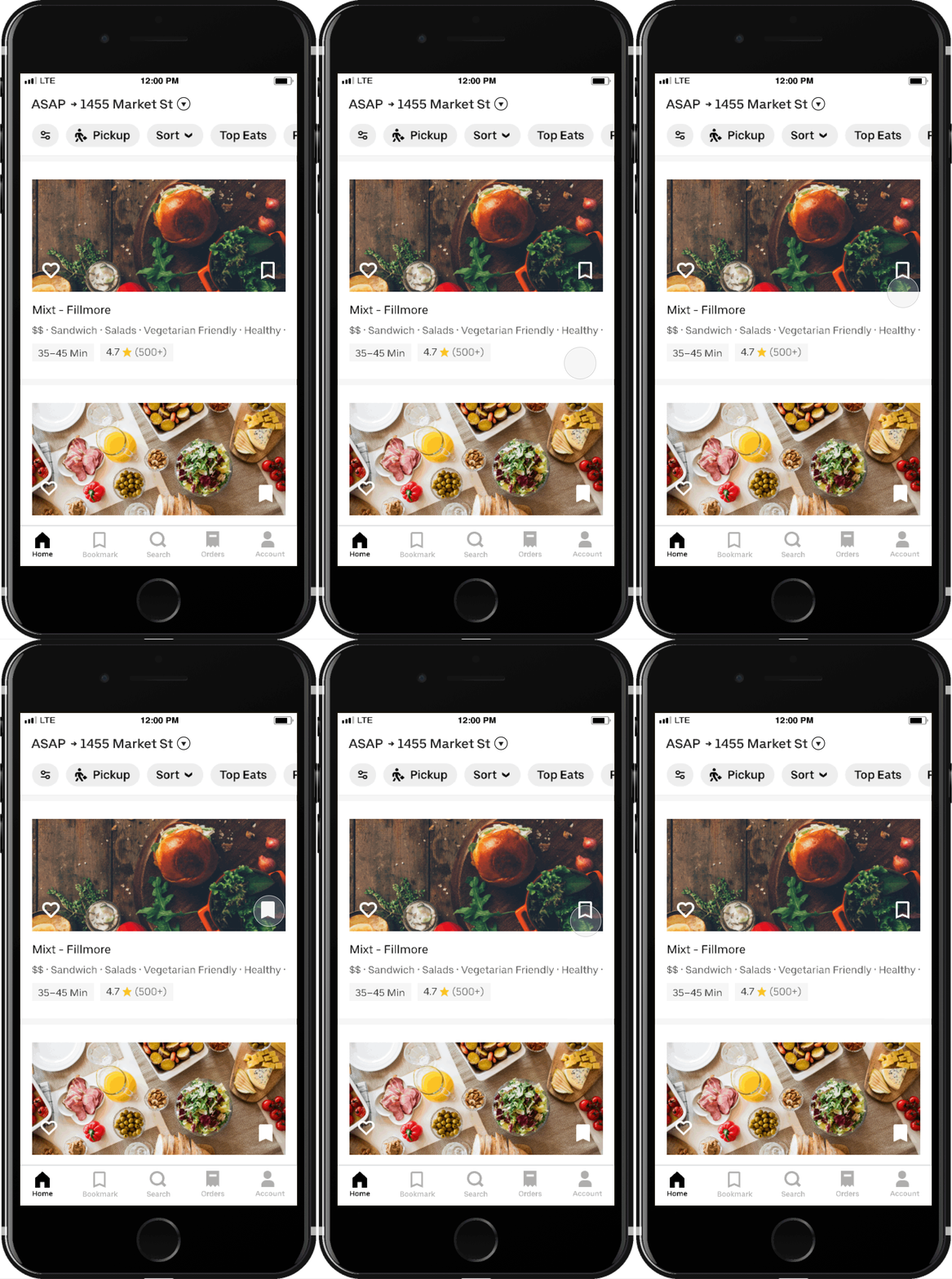
Modified restaurant feed
New Bookmark page
User testing revealed two gaps:
Removing a restaurant felt too final, and users wanted a quick way to restore something they deleted. They also wanted more control when reviewing multiple bookmarked options.
To solve the first issue, I added a History page accessible from the Bookmark view. It lets users re-add previously removed restaurants, starting with items from the current session and extending to past sessions. This also gives users a helpful jumping-off point when beginning a new search.
To support more structured comparison, I also introduced sorting controls that let users reorder their bookmarked restaurants by key decision factors like rating, popularity, or delivery time.
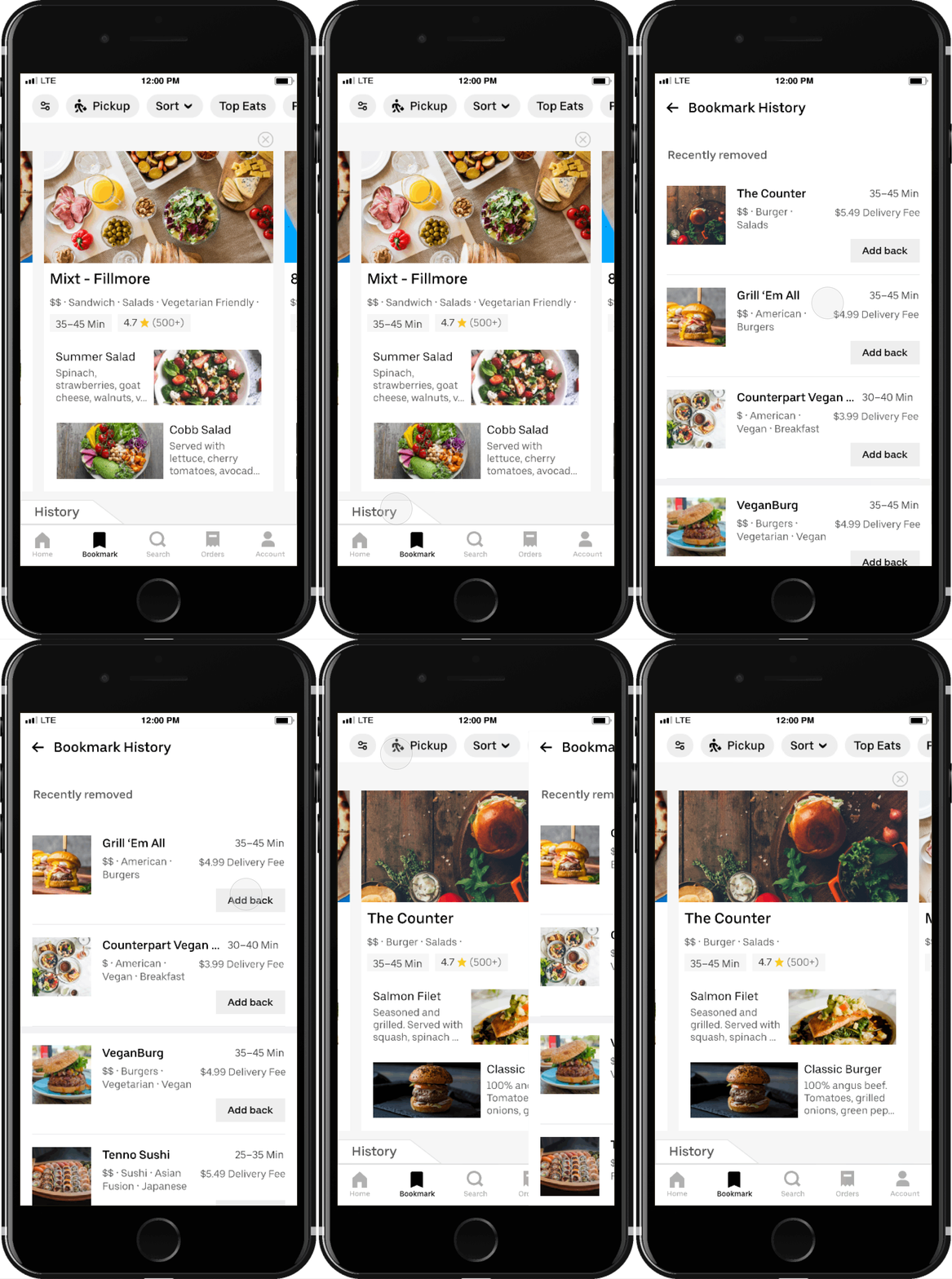
History tab
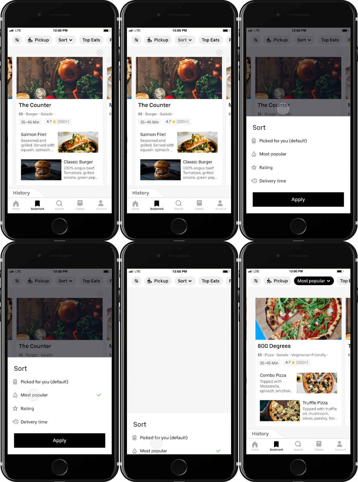
Sorting functionality
Next Steps
Final Mockups
If this were a live feature, I would continue usability testing to refine edge cases and validate how well it supports real decision-making. After launch, I would track metrics such as feature usage, conversion from bookmark to purchase, and orders from restaurants users had not tried before.
User testing also highlighted a strong opportunity in group ordering. Several participants imagined comparing options together. I would explore shared bookmarks or shareable collections to support collaborative decision-making and open up a new path for social discovery within Uber Eats.